The #MakeoverMonday Challenge week 20 involved visualizing auto insurance rate in the US by State. The original viz was a radial chart created by howmuch.net:
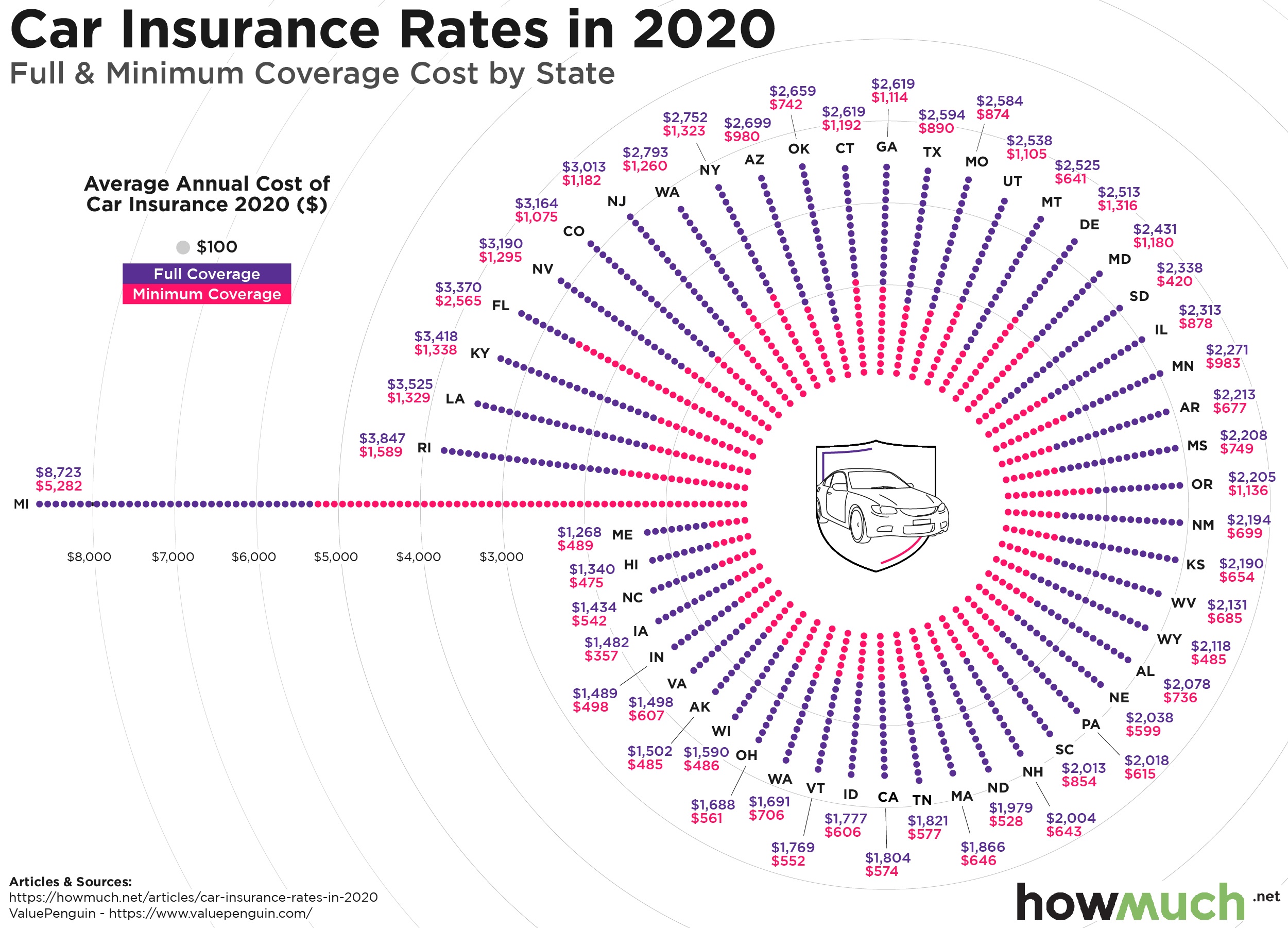
What works?
- Title and subtitle are short and descriptive.
- Design is visually attractive, related to the topic (circular chart, that resembles a wheel).
- I liked the color palette.
What can be improved?
- I did not get the distinction between full & minimum rate by looking at the chart, I thought it could be clarifying to add the explanation in the chart or as a hover in an interactive version.
- Even though the circle is attractive, it is not as effective to compare between states, especially between states that are far apart in the wheel.
- The full and minimum rates are distinct measures, but the chart gives the impression that they add up. It can be a little confusing.
- My final solution was a dot-plot with the minimum and full rates encoded as circles joined together by a line. States are ordered by their rank number. And I added a map to reinforce the ranking, especially the 3 most expensive states.
- This is my makeover: