The topic
Before June ended I wanted to create some kind of visualization that would commemorate this LGBT Pride Month.
Several topics came to mind. Some of them were serious subjects -like hate crimes occurring around the world- and others were lighter in tone (I thought about doing a viz of one of my favorite tv shows, RuPaul’s Drag Race).
After thinking it through, I decided to come back to the topic of films that I explored in my visualization of female directors.
In that viz, I showed how really few popular films were directed by women, and I showed how that trend has not changed significantly in the last years.
With that data-story, I wanted to argue that it is not trivial who directs films because that role has the power to tell the story, the power to portray (or not portray) diverse life experiences. Having a landscape of directors that is so unbalanced according to gender implies that there are experiences and points of view that are not being represented. Groups of people that are not seeing themselves on the screen, who probably don’t relate or identify with the stories that are being showcased in the mainstream film industry.
Something similar happens when we talk about how LGBT people are represented in cinema and in cultural products in general. A documentary that shows this dimension very well is “The celluloid closet” by Rob Epstein and Jeffrey Friedman, which shows how throughout the 20th century LGBT characters and stories entered the film industry only interstitially, indirectly, and mainly through subtleties.
Today the reality is different. Every year many films that portray LGBT experiences are produced and released around the world. So the goal of my visualization was to highlight those films -those cultural objects- that help the LGBT community (especially teenagers and youth) to find narratives and characters with whom to identify and that help them develop their own biographies.
The data
For the female directors’ project, I analyzed data made available by IMDB. So I tried to start from there. However, the keyword system of the website that classified the films as LGBT-themed did not seem precise or exhaustive (films that did not have LGBT lives at their center had the tag, and other movies that for me were part of the canon did not have the tag).
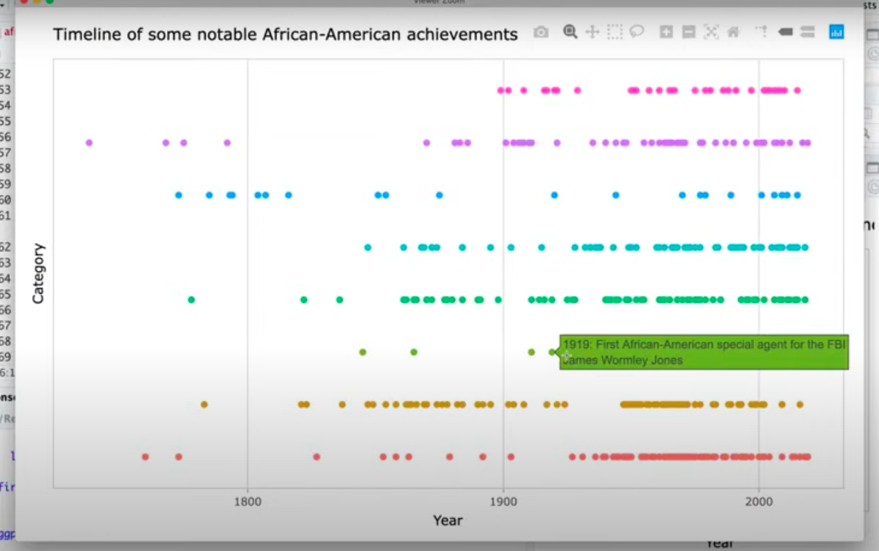
My next exploration was Wikipedia. There I found lists of LGBT movies by decade, which I was able to extract and consolidate using R. With that data I could see how the number of movies that portray LGBT characters or stories has significantly increased in the last 30 years.
This data was promising: I had 2,258 titles, the year of release, the film’s director, country, and genre. However, I had no detail regarding what the movie was about, and collecting that information was going to take a long time. So I left that data for some future exploration.
In the end, I came across a very comprehensive article on the website Rotten Tomatoes, that featured the 200 best LGBT movies. The list had the hyperlinks to the entry for each film, which allowed me to get their synopsis. With that information I classified each movie into one of five categories, depending on which was the focus or main character of the story (lesbian, gay, bisexual, trans or LGBTQ+ in general).
The Viz
I got a first idea on how to visualize the data when I was watching a Tidy Tuesday live Screencast made by David Robinson. There, David made a timeline using ggplot that I liked and thought I could use:
With that idea in mind, I made a very basic sketch. I started with something similar to that timeline, but due to the structure of my data (there can be more than one movie per year) I realized that what I needed was a “bee swarm plot”.
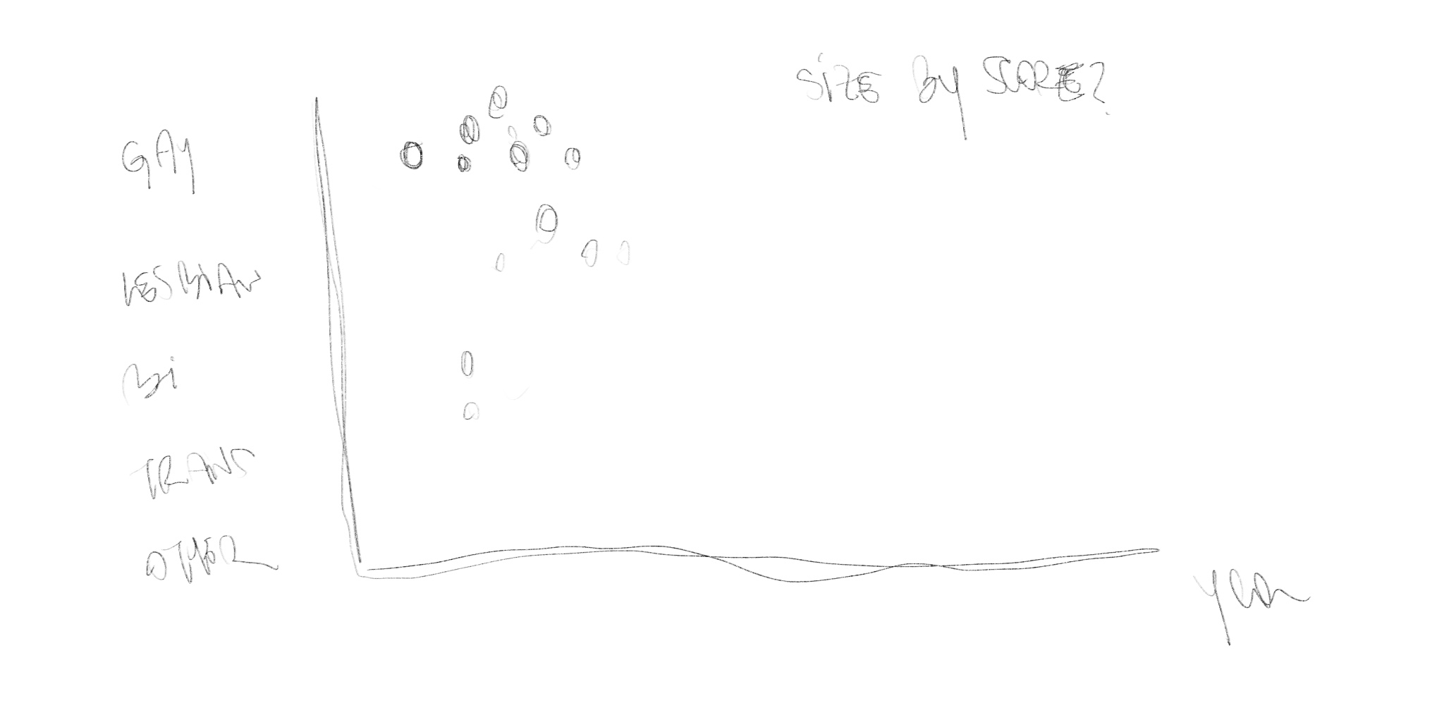
I imagine there must be more elegant ways to do a bee swarm plot, but I followed Ken Flerlage’s principle that everything can be visualized in Tableau if you have an X & Y coordinate.
So with a combination of tools/formats (RawGraphs & SVGs) I extracted the X & Y coordinates of the bee swarm plot and added them to my LGBT movie data frame. With that data, I was able to make a first version of the chart in Tableau, and I started to refine the design from that.
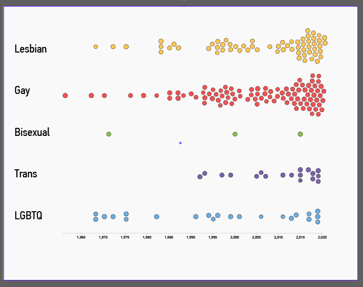
For the interactive layer, I wanted to allow the user to get more in-depth information about each point/movie. So I added a tooltip that included the title, year, rank, and score of the movie.
Along with that basic information, I added an excerpt from the synopsis and the poster of the movie (which I incorporated into the tooltip following Ryan Sleeper’s tutorial).
To convey a visual feeling of Pride Month I looked for inspiration on the web and found a free font that I loved and that was inspired by the rainbow flag creator, Gilbert Frank. I used the font for the title and the labels.
After that, I was almost ready. But I wanted to add some text that would not compete so much with the chart. So I added a black column in the left that would give me space to add some written context of the data, explain how to read the chart, and add a quote that I feel sums up nicely why LGBT movies are important to many people’s lives.
After several tweaks of aligning elements, adjusting the size, etc. I got to this final product
Any feedback is welcome at @maxthamt!