This is my first entry for The SDG Viz Project that is being carried out by Brian Moore, Vinodh kumar V R & Jacqui Moore. Because education is one of my research interests I thought the challenge for this month (SDG 4) was a good moment to participate.
When thinking about what I could visualize I remembered that at the end of last year the OECD launched the results of the Pisa 2018 study, which included a chapter regarding the target 4.1 of the SDG 4.
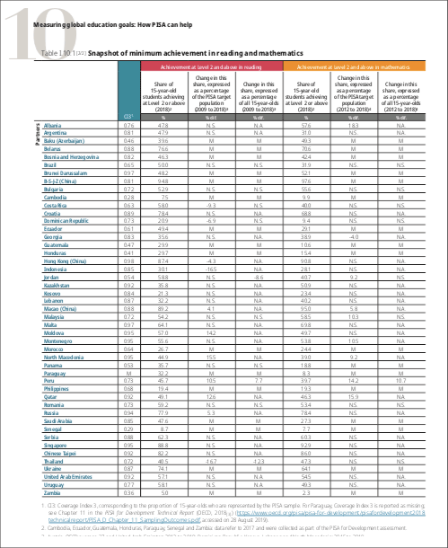
Using the Pisa 2018 data and the Pisa for development 2017 data, that chapter includes information about the share of students (15-year-olds) that achieve at least minimum proficiency in reading and math, for 84 countries around the world.

I thought the SDG Viz Project could be a good excuse to use the information of those tables and design a visualization that could communicate a clearer message and allow a more effective overview of the data.
My first design choice was to work with a subset of the data. To narrow the analysis I decided to focus on one continent, so I worked with countries from North, Central, and South America. The underlying question was “What are the educational challenges in that region regarding the achievement of the SDG target 4.1.1?”
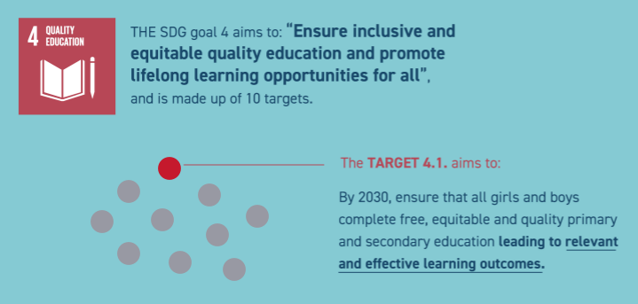
The SDG goal 4 is an enormous enterprise on its own. So in the introduction of the viz I wanted to make clear that I was focusing on a fraction of that goal -the target 4.1.1- which I illustrated coloring only one red dot (out of ten targets).

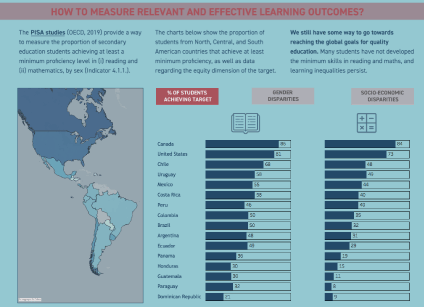
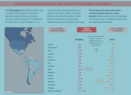
Now, to show how close or how far are countries for achieving that target, I designed a three-layered visualization:
- The first layer presents a parallel bar chart for the results for reading and math, showing the high diversity of results that we see on the continent. Canada is relatively close to the target, while in countries like Dominican Republic, Paraguay, Guatemala or Honduras most of 15-year-old students are not reaching the minimum skills in those two subjects.

- The second and third layer addresses the equity dimension of the results. The SDG goals challenge countries so that no one group of people can be left behind. The Pisa team addressed this dimension using a “parity index” that describes how equal or unequal are the learning results: if the index is closer to 0 then the learning results are favoring the boys (and that happens in some countries regarding math results) or the economically advantaged students (and that happens for both subjects in most countries, but we also see here diversity between countries).

- Finally, I also accompany these three layers with a map with the main results, which does not add new information, but reinforces the main points and can help the reader localize the countries with data.
One of the main points of the OECD report - and one that is also a key message of this viz - is that we still have some way to reach the SDG goal 4. This data challenges countries to rethink their policies, strategies, and collaborations in order to achieve the target by 2030.
The interactive viz is here: